Eduvation Blog
Monday, September 28, 2009 | Category: Sharp Thinking
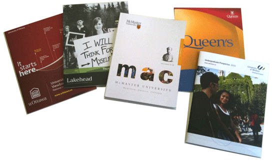
The 2009 Crop of Viewbooks
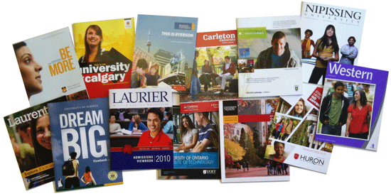
Many of you already know that my ulterior motive in attending the annual Ontario Universities’ Fair in Toronto is to pick up a load of viewbooks from dozens of colleges and universities at once. (But hey, look at it this way: I’m saving you the postage, envelopes, and the hassle of an imaginary prospect in your database!)
Here’s a quick overview of some things I notice, looking through this year’s haul. Please remember that this is not a comprehensive survey of Canadian viewbooks, or even of Ontario viewbooks — I’ll be getting a lot more Ontario College recruitment pieces at the Ontario College Information Fair next month.
Big and Glossy
Unlike the plummeting popularity of Hummers and oversized SUVs, it’s notable that the majority of university viewbooks remain big and glossy as ever. This isn’t necessarily the wrong strategy, either — ourUCAS Applicant Study continues to find readership of viewbooks high, and their influence in applicant decision-making (and particularly parental involvement) crucial. Providing prospective students with plenty of information, persuasion, and photography is not necessarily a bad thing. In Ontario, uToronto, Ryerson, Carleton, Nipissing, Western, Guelph, UOIT, Laurier, Laurentian, York, and Huron are all distributing viewbooks that seem just about as hefty as ever. Some of the heftier out-of-province books come from uManitoba, uCalgary, uLethbridge, and particularly uAlberta, whose “Dream BIG” viewbook is slightly oversized to stand apart. uLethbridge’s viewbook proclaims, “Discover the Real U” — an interesting slogan that simultaneously suggests an intimate institution that will nurture a student as an individual, and perhaps also suggests that some other Alberta institutions are perhaps not “Real U’s”. Very subtle!
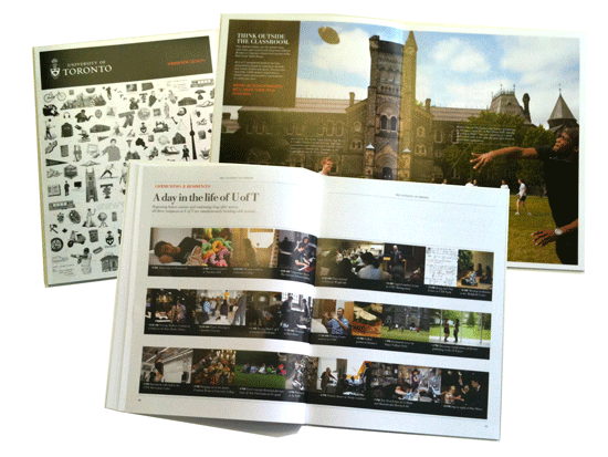
The University of Toronto’s undergraduate viewbook has undergone a major transformation this year, after several years of continuity. The cover features an array of small black-and-white illustrations and icons, while the contents are full-colour throughout. Much of the photography features call-out captions to label students and faculty members, and 6 full pages are devoted to describing the surrounding city of Toronto itself. (Clearly this viewbook is working harder to position uToronto for prospective students outside the GTA.) A memorable two-page spread features a timeline of photographs illustrating “a day in the life of UofT.”
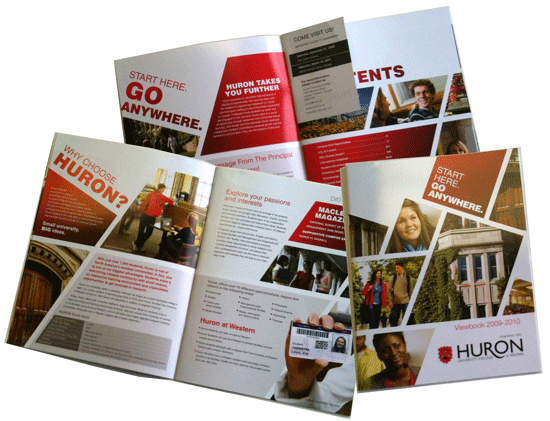
Huron University College (at UWO) has a substantial viewbook with a dynamic new look in keeping with its new brand, “Start Here, Go Anywhere.” This look seems like quite a departure for Huron, whose viewbooks have generally been pretty conservative in layout and design in recent years.
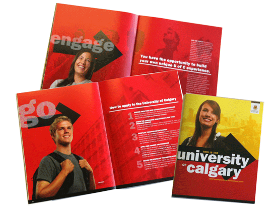
The University of Calgary has often distributed striking, vibrant and oversized print materials, and this year’s new look is no exception. Bright reds and yellows, dynamic headlines and energetic layouts create an impression of an innovative university in a fast-paced urban environment. As in previous years, at the OUF this viewbook was distributed with an 8-page insert titled “Find Yourself Out West,” featuring photos and testimonials from 5 Ontario students who are currently enjoying themselves at UofC.
Big but not so Glossy
Although big and glossy still rules the day, a number of institutions are portraying a more environmentally-conscious image by printing their viewbooks on uncoated paper. (Of course, the reality can be that full-colour printing on uncoated stock can have just as much impact on the environment as coated stock, depending on the percentage content of post-consumer recycled waste, the use of bleaches, soy-based inks, etc.) Queen’s has continued the uncoated approach they used last year, but they have been joined by Lakehead, Windsor, McMaster, Trent, and uOttawa.
Lakehead’s viewbook is reversible — one front cover for the Thunder Bay campus, and one for the Orillia campus. Rather like the new Lakehead fair exhibit, this creates the impression of equality for the two campuses, although inside the book, 13 pages are devoted to Orillia, and 63 pages to Thunder Bay.
McMaster’s viewbook takes an entire page to emphasize the 502 trees, 1.3 million litres of water, and 31,745 kg of air emissions they saved by printing the viewbook on enviro paper. uOttawa’s brief brochure points prospective students to its website, where they can order a personalized viewbook to save on wasted paper.
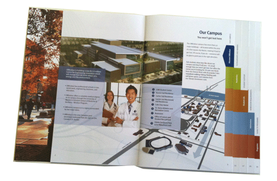
uWindsor (above) has the uncoated look on the outside of their viewbook, but all the pages throughout are glossy coated stock. Moreover, they have clearly invested in this print piece, since sections have staggered page widths and index-style tabs down the right margin for ease of reference.
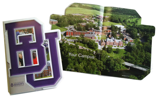
Bishop’s University, based in Lennoxville Quebec, has continued to use a distinctive die-cut shape for its viewbook, like it did last year. The pages have angled corners to accommodate the “BU” logo on the front cover — an elaborate and somewhat expensive print technique, but one which makes Bishop’s print materials stand out a bit more than they might otherwise. (The only other viewbook in this year’s crop that makes use of die-cut pages is York’s, which continues to have simple rounded corners.)
Landscape Orientations
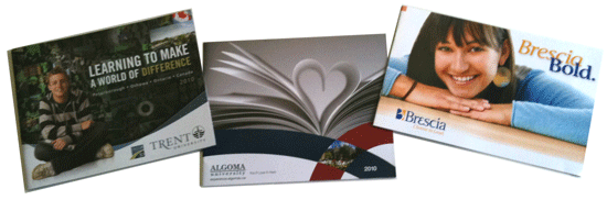
In previous years, we saw a proliferation of landscape-oriented (ie horizontal) viewbooks — a print technique that can add significantly to cost, even though it may not appear extravagant. (Last year, even conservative uToronto used the landscape format.) Evidently, many institutions decided that this was no longer a way to stand apart from the crowd — which ironically means the 3 viewbooks that were produced in horizontal format this year do just that, for Trent, Algoma, and Brescia.
Mini-Viewbooks or Brochures
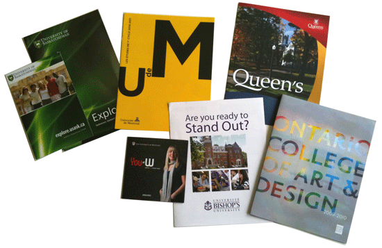
One trend that seems to be continuing from previous years, though, is the use of micro-viewbooks or introductory brochures instead of handing out full-fledged viewbooks at the Fair. Several out-of-province schools exemplify this approach, including uMontreal, uSaskatchewan, uWinnipeg and Bishop’s University. In Ontario, the clearest examples were Queen’s and uWaterloo, who distributed leaflets freely, and had faculty-specific brochures available, but kept their full viewbooks behind the counter and gave them out infrequently.
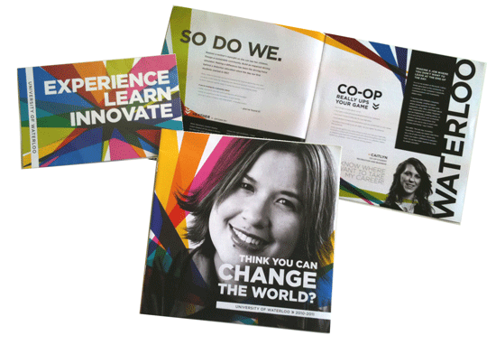
The University of Waterloo’s recruitment brochures are also a striking departure from former years, when a solid black or white cover with “blind emboss” has been used to stand out from the competition. This year, the uWaterloo brochures feature the bold and colourful look of the new brand, although the logo is still in development.
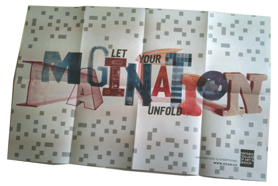
As you might expect from a creative institution, the Ontario College of Art and Design (OCAD University) distributed a poster which folded out of a small brochure. “Let your imagination unfold” is a great call to action that makes the most of this unique format for a recruitment piece.
Obviously there is much more that could be said, even about the 45 viewbooks I picked up at the OUF. There are hundreds more books out there from other institutions, too. But I welcome your comments about interesting new tactics, techniques, content ideas, or creative approaches you think are noteworthy in other viewbooks out there. Please comment below!
Post Tags: Marketing, Recruitment, Viewbooks
All contents copyright © 2014 Eduvation Inc. All rights reserved.